~ Zakari Kovalis, Exploration Vessel Katydid, Log Entry YC112.09.23

Rhea is just around the corner and it’s got so much amazing stuff that the opt-in version of the star map overhaul almost snuck under the radar! Not to worry though, I’m here to tell you all about it so get ready to see some very exciting progress on one of EVE’s most fundamental features.
We’ve wanted to work on improving both the visual experience and usability of the map for some time now, but it took a kick in the pants from our recent new player user testing to move it all the way up the priority list. We have our eyes set on a range of improvements, so in Rhea you will only see the first stage of what we have in store. That said, we hope that many players will already prefer the beta map over the existing one.
Allow me to highlight a few of the most exciting changes coming in this release:
UPDATED VISUALS
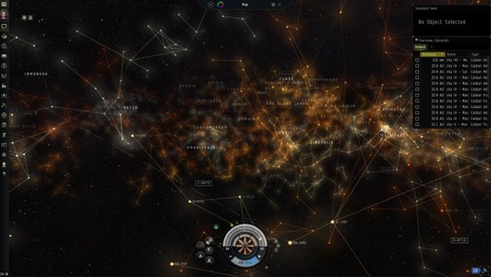
The new map is beautiful. We’ve put the map in an actual space scene with nebulas and stars and ditched the old flat black background. We’ve also made a lot of changes to coloring, highlighting, and labeling in the map to improve readability and aesthetic appeal (sexiness).
WINDOWED MODE
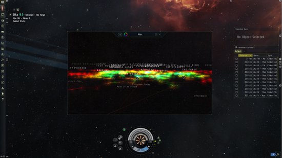
The new map can be made into a window that is completely resizable and retains 100% of the functionality and interactability of the full screen view. All you need to do to take advantage of this is head to the map control panel at the top and click the box icon. You will notice that in addition to the ‘floating’ mode there are also ‘dock right’ and ‘dock left’ modes, both of which will lock the map to either side of your screen while pushing the main scene over to fill the rest of your screen space.
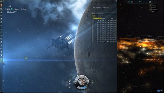
These modes can also be resized and makes it very easy to run the map on a second monitor full time. AMAZING.
ZOOMING
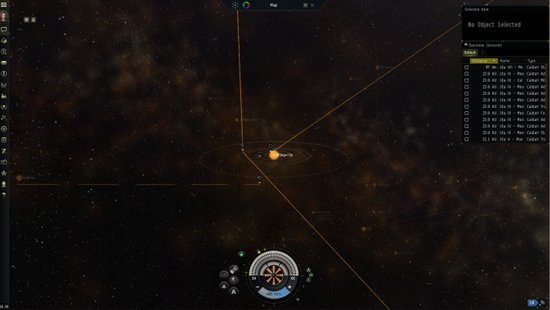
We are working towards consolidating the solar system map and the star map into one seamless map. You can see the beginnings of this work by zooming in (by using the mouse wheel, double clicking or control clicking) on any system. The map will seamlessly zoom all the way down to the solar system level, showing you the location of stations and stargates. For now, using scan probes will still only be possible in the old solar system map but hopefully before long we can integrate that, together with more solar system scale functions, into the new map.
In addition to those major changes, there is a range of smaller ones:
You can now use the ‘grouping’ options to show the map at region or constellation level, rather than only showing all the stars at once
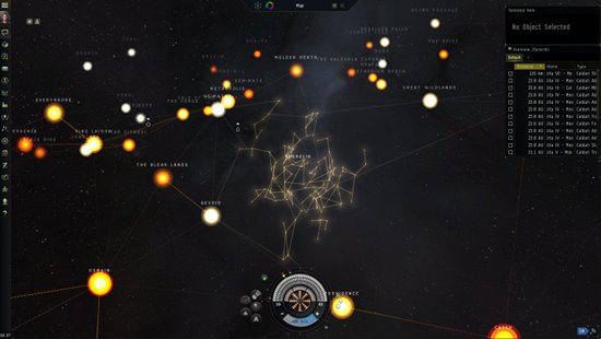
You can mark a home station with a label
The display of statistics and filters has been normalized in some cases to improve readability
The code that handles ‘picking’ has been rewritten which should improve the feel of system selection
We have a lot of work going into performance improvement, largely to help support windowed mode.
No search functionality
No jump range visualization for ships with jump drives
The map won’t currently load if you’re in a wormhole
The sovereignty filter hasn’t been hooked up yet
BUT CCP RISE, THIS STILL ISN’T DOTLAN
You’re right and we hear you. I have two different replies to this question. Hopefully both make you excited for the future.
First, this is only step one for the star map. After we gather feedback from the beta and validate the big new functions I mentioned above, we are planning to a take a hard look at what kind of strategic value is present in the map currently and then find ways to add to that value. The results of this work could be anything from a ‘recent filters’ list to help you switch statistics displays more easily to the removal of useless filters to a jump planner. Keep your eye out for these changes in January and February and make sure to give us feedback on this subject in the meantime.
Second, we aren’t releasing it just yet, but we are hard at work on developing a dedicated two-dimensional, ”DOTLAN-esque” mode for the map which will be focused entirely on strategy and information. This mode looks very promising but we’ve chosen to hold off for the Rhea release in order to focus completely on the updated 3d map so that you get the best feature possible for Rhea. Look for progress reports on the tactical map after Rhea.
OK, ENOUGH TALK, HOW DO I TURN IT ON
Just like past beta features, simply open up the escape menu by pressing ESC and in the lower left section of the ‘General Settings’ tab you should see an option to enable the new map.
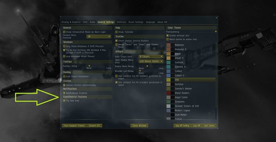
Once clicked, you will get a second map icon in the Neocom with a small beta tag on it. Click on that and bam, new map.
Your participation in beta features is very much appreciated and we can’t wait to see what you think of our new map. Once you’ve checked it out, post your thoughts in the comments thread for this dev blog so that we can make the map the best it can be before we release it officially.
See you in space o/
[ Original Dev Blog ]
No comments :
Post a Comment