CCP Fozzie sure made the headlines last week with the announcement of coming sov changes, a decision which has been meet with a wide array of emotions by the EVE Online community (mostly positive), today he made a new EVE-O thread to discuss changes and tactics with the EVE Online players, read on and make sure to comment on the link at the end of the piece to let him know what’s your take on this.
Another quick post here to let you know of a change Five-0 have ready for testing on Singularity.
When Scylla is released, the default CSPA charge for newly created characters will default to 0 ISK instead of 2950 ISK.
For any existing characters that have their CSPA charge still at the default of 2950 ISK, the charge will also be changed to 0 ISK. Characters that have chosen to set their charge to any other value will be unaffected. All characters can still configure this setting as normal (via the Settings option in the Mail window).
In general, we want to be enabling social interaction in EVE rather than blocking it. The anti-spam value of this feature did not outweigh the downsides of requiring players (especially new players) to pay in order to talk to each other. Most experienced players already change their CSPA charge to 0, so we do not expect this change to negatively affect a large number of players.
As always we’re looking for feedback (in this thread) and reports on any issues found (using the in-game bug reporting tool) with this change.
Hi! I’m CCP Punkturis and on behalf of Team Five 0 I want to tell you about some of the changes related to corporations that we’ve been working on for Tiamat, which will be released on February 17, 2015!
We know the effort and time that CEOs and directors spend on managing their corporations is very valuable, and we want to make things easier for them. That’s why we went to the forums and asked for your "corp little things". A lot of good ideas surfaced and we tried to prioritize targeting them and hope you’ll like the things we’re bringing you this time.
CCP karkur and I, under adult supervision from CCP Tuxford have been experimenting with improving the EVE fitting experience.
The fitting window hasn’t gotten much love since Apocrypha and we really want to address that and make it a powerful and fun tool, move it a bit closer to 3rd party programs like EFT and Pyfa.
We have been looking into features like:
- Allowing pilots to try in the fitting window modules and rigs they own or don’t, to see what effect they have before committing.
– Try before you buy
– Simulating active and overload states of modules, docked or in space. No need to leave the station to see what your hardeners can do.
– More accurate and rich information on attributes in the fitting window.
There are a ton of ideas floating around that could be added to the list, but what would you be interested in seeing that would improve your fitting experience?
Finally, finally, Recons. I know you guys have been asking for a long time now so even though timing was pretty tight with vacations coming up I want to get this class in for January.
We had a few big goals with Recons:
Give Combat Recons something to make them stand out as a unique and interesting set of ships Close the gap somewhat between Recons and T3 Cruisers, though this will also be a goal during the T3 Cruiser rebalance Align Recons around ship developer trends established in other classes (Roden Lachesis should not use missiles for example) Address any other general balance issues or pain points (hello Pilgrim)
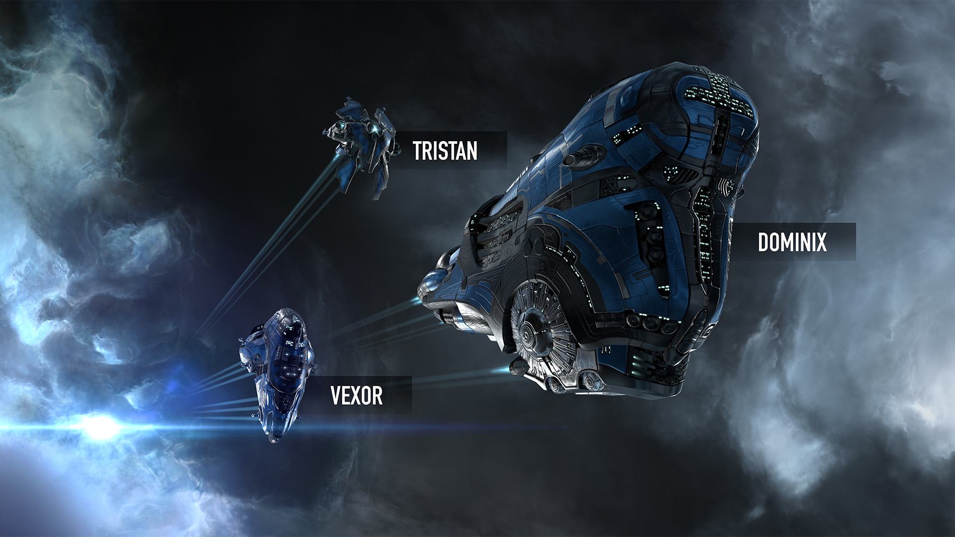
Negotiations between CCP and the Quafe Company regarding sponsorship for EVE Fanfest 2015 have reached a conclusion and our friends at Quafe headquarters have committed to a tribute of three branded ship skins for each capsuleer attending the annual gathering.
The ships, coming your way in the form of single-run blueprint copies, all hail from Gallente Federation shipyards and should be well known to drone warfare specialists.
The Quafe Tristan, Quafe Vexor, and Quafe Dominix will be distributed separately through the redeeming system in the months leading up to Fanfest, starting with the Quafe Tristan on January 15. The Quafe Vexor will arrive on February 11 and the Quafe Dominix warps in on February 27 so all three ships will be in your hands before Fanfest.
The ships will be delivered to existing ticket holders on these dates, and upon Fanfest ticket purchase after that, until sales of Fanfest tickets cease.
All three ships are free and time-exclusive for Fanfest attendees but will be made available through other means around Fanfest time to those who can’t attend the glorious event in person – more on that later.
Let us toast to the amazing Fanfest to come by raising our bottles of Quafe!
We have identified an exploit relating to the Storage Depot loot
containers in the Standard Sleeper Cache site that was released during
the Rhea deployment on Tuesday, December 9th, 2014. This exploit causes
the containers within this site to respawn loot an infinite number of
times.
We would like to inform players that any abuse or exploitation of sites
with this issue will be deemed to be in violation of the EVE Online
EULA and Terms of Service. Players engaging in the use of exploits may
face punitive action, up to and including temporary or permanent account
suspension.
Please ensure that you refrain from any involvement in this exploit,
and file a support ticket to contact customer support if you have any
concerns or issues in relation to this announcement.
A short unscheduled reboot of Tranquility will be occurring at 00:40
UTC in order to address this issue. We expect Tranquility to be online
and accepting connections again at 01:00 UTC.
On December 4th, CCP RubberBAND took to the official EVE Online forums to announce tentative plans to first remove seeding of industry teams by the end of the month, then disable the UI features relating to industry teams in early 2015. The feature, added to the game as part of the July 22nd Crius patch, apparently flopped in the industrial community. According to RubberBAND's post, the use of industry teams in manufacturing has never exceeded 10% of all jobs completed and their use was nearly nonexistant in research jobs. The removal of an unsuccessful feature from the game is unusual in EVE Online, a fact that RubberBAND acknowledged by calling the decision "a fairly unprecedented course of action for us." However, CCP views the current implementation of industry teams as an addition of the "wrong type of complexity" to the game. That's not to say that industry teams as a concept are off the table; RubberBAND made it clear that more time will be spent at a future date to rework the idea into something that adds a more significant value to EVE Online.
Reactions to the announcement have been fairly supportive; many responders in the forum thread acknowledged that the idea of industry teams is appealing, but various aspects of the current implementation - be it the auction aspect of getting teams, the lack of signficiant bonuses, or the need for specialization - have been found wanting by the community. Some, though, question whether the removal of the feature is necessary. Though undoubtedly a low number in the grand scheme of things, there are those who use and enjoy the feature even in their current implementation. There certainly wouldn't be much downside to leaving the feature in the game in its current form until it can be reworked. Either way, it will be some time before the feature sees any substantive work done to it, as CCP continues to grapple with their plans for revamping nullsec through the next few patch cycles. SOURCE: EVE Online Forums
As part of the Crius Industry release, a feature was added that most of you are probably familiar with called Teams. This feature allows you to hire teams of specialist NPC workers to boost your industry jobs for a price.
CCP Terminus here to talk to you about the changes coming to medical clones in Rhea on December 9th.
The Current Medical Clone System
When a players capsule (known colloquially as a pod) is destroyed, their clone is killed, leaving behind a frozen corpse floating through space. Upon reviving in a new clone in a space station, the pilot must then upgrade their medical clones grade to cover the amount of skillpoints they have accrued though skill training. If that player fails to do so and is podded again, they will lose skillpoints if their clone grade isnt high enough.
This thread is for feedback and issue reporting on a small change team Five 0 have done for Rhea to the way joining a corporation works.
Until this change the process for joining a Corporation has been as follows:
1. Character applies to corporation.
2. A corp member with appropriate roles invites player to join.
3. Character accepts invite.
4. The Character is entered into the corp.
With this change implemented the above functionality still applies but a second method is now available:
1. A corp member with appropriate roles invites player to join.
We're making some tweaks to Pulse Lasers of all sizes in Rhea, as well as Scorch ammo.
At
the moment Pulse Lasers are quite reliant on T2 Scorch ammo to be
viable and powerful. The main goal of these changes is to reduce the
reliance on Scorch for Pulse Lasers, making other ammo types a bit more
useful. Secondary goals are improving the balance between different
tiers of Pulse Lasers and improving the quality of Capital Pulse Lasers a
bit.
The basics of the change are:
The base optimal range of all Pulse Lasers is being increased by 5%.
The falloff range of all Pulse Lasers is being increased.
The optimal range bonus provided by Scorch ammo is being reduced from 50% to 40%.
The result is that optimal range for Pulses without Scorch will be
increasing 5%, and optimal range for Pulses with Scorch will be
decreasing by 2%. The percentage increase in falloff is different
between the different sizes of Pulses, which helps even out the power
levels of the different Pulse laser tiers slightly.
Falloff increase per Pulse type is: Small Focused Pulses, Heavy Pulses, Mega Pulses: +25% Dual Light Pulses, Focused Medium Pulses, Dual Heavy Pulses: +33.3% Gatling Pulses, Giga Pulses: +100%
These changes are on SISI for your testing pleasure, feel free to give them a try and let us know what you think!
As promised, here is your brand new ship-moving ship – the Bowhead.
We originally expected this to be a sister ship to the Orca, but after digging into the details realized that it was really more of a freighter and by setting it up that way we could avoid heavier skill requirements that had nothing to do with its role. This means we are going to introduce a new skill: ORE Freighter, which requires ORE Industrial III and Advanced spaceship command V just like other faction freighter skills.
There isn’t much else to say other than that this ship is intended for a specific niche: high-sec transport of fitted/insured ships. It may find applications in other parts of space (especially because of the reduced jump fatigue), but we aren’t really worried about hitting anything outside of the high-sec application. Because we were starting from scratch here, we decided to give a little more fitting flexibility (mid slots and rig slots), meaning the base hp is set a little lower than other freighters since you can actually get the EHP higher using rigs and a DCU.
Let us know what you think.
BOWHEAD
Ore Freighter Bonus:
5% bonus to max velocity per level
5% bonus to ship maintenance array capacity per level
Role Bonus:
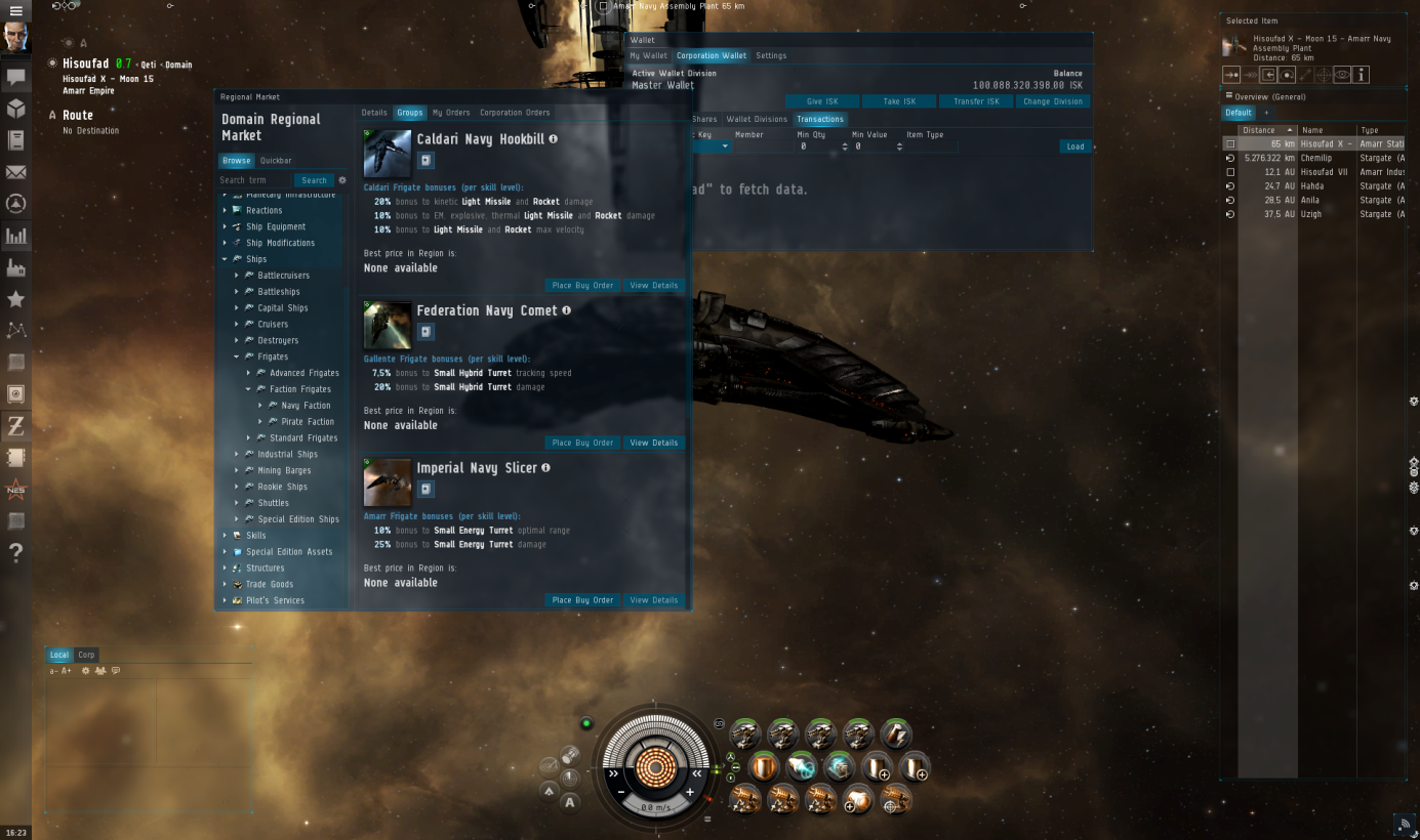
On behalf of Team Game of Drones and the EVE UI Group, I am here to tell you about a new look for the EVE UI that we are working on. It’s a big revamp of the look of the whole EVE user interface – while keeping the functionality almost entirely the same. The current look dates back to around 2000, and we want to make sure EVE looks like a modern and beautiful game, but also that you have an interface that helps you do what you need faster and better.
The look brings a new kind of blurred window transparency that lets you see the scene behind UI windows much better while still clearly seeing the contents of the UI. We have also made a new icon set that is designed to let you find and open the right windows faster.
For the look itself, we want EVE’s UI to look and feel more like something fitting a science fiction universe, and a bit less like an operating system.
Here is a screenshot to give you an immediate idea of the new look:
(click to enlarge)
We realize it’s a big change, so to make sure we get enough feedback from you, we will bring the new look to Singularity today so that you can see it in action and help us make sure all the functionality you need still works well with the new look. Read ahead for more on the background and our vision for this project, and how you can give us feedback!
Background
Even though we feel we‘ve really picked up pace with various quality-of-life interface fixes and improvements throughout the last few years, as well as raising the bar quite a bit with usability and visual intrigue of new features, we have never attempted to do an overhaul of the look and feel the UI as a whole. That is, until now.
It all started with a project called EVE UI Modernization. The UI Group came together in an Icelandic summer hut way up north (behind the wall) to define a vision for a new and better EVE UI. In that effort we asked ourselves what “better” means and found out it was a combination of many components that all had to come together in a holistic way. The group came up with a strategy to push the UI into a direction of having a better identity, better functionality, better usability and better aesthetics.
The first efforts where Initially kicked off by a couple of individuals on the UI Team as conceptual work and has been ongoing behind the scenes for quite a while now and has recently been adapted by Game of Drones to push it all the way to Tranquility with ongoing support from other UI developers.
The goals
For the sake of clarity, I have prepared a list of the goals we set out to reach with the UI Modernization effort.
Roll out a complete new UI that will define the visual direction for EVE UI in the coming years
Less operating system, more Sci-Fi, and militaristic looking UI
Functionality and usability should feel modern and intuitive
Have the UI complement the beautiful New Eden view, instead of blocking it.
Better consistency between UI control look and feel.
Use colors in a sensible way.
Simpler, and more recognizable icons with a clear distinction between icons that represent items vs icons that represent UI controls and labels.
Now, let me explain a bit further.
Look and feel
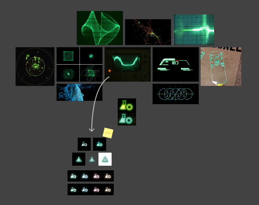
Our UI designers didn’t have to meet for long to reach a consensus that they wanted the UI to look more holographic and futuristic than it currently does. For interacting with the UI, instead of using skeuomorphism (a word I’m pretty sure to have been invented by a certain fruit company that shall not be named here) such as having a button feel like an actual button when pressed, we want to use burning light and glow to indicate button presses, blinks and such. Here is a part of their vision statement for the EVE UI Modernization project: Everything is made from light and behaves similar to light. Objects are dim and darkened or de-saturated when off/inactive instead of just alpha faded. Objects flicker and offset when under damage, power out, power disruption. Objects are drawn in, they turn on and flicker slightly to immitate a more realistic, mechanical state. Retro references used by the group was things like Jet HUDs, LED gauges, oscilloscope / vector scope, lasers, spectrum analyzers in 70‘s stereos.
(click to enlarge)
The re-skinning of the UI and updating of UI component and menu icons is just the first strategy step in fulfilling this vision and will pan out more in the coming months. We wanted to make a clearer distinction between windows and interface elements, so the Neocom, Overview and Station Service Window, all integral parts of the interface and always visible, will feel less intrusive than windows that you open, use and close.
What can we learn from the dinosaurs?
Practically nothing. They weren’t exactly brilliant now were they? That is unless you’re talking about shader programming. We’ve always felt it’s a shame how good of a job our UI does of concealing the space scene. Sure, we have window pinning, but the simple transparency effect will in many cases render the contents of the window in question un-readable. So, in order to solve this, we’ve placed a blurred, de-saturated and brightness-filtered see-through background behind all windows. What this effectively gives you is T-Rex vision (bingo), as one of my co-workers branded the feature, as you can’t really make out the background details, but can still quite easily make out movement and bright spots. What we’re hoping to achieve with this is giving you better sense of what’s happening in the space scene, even though it’s completely blocked by windows, without having it compete with the content of said windows. Pinned windows are only blurred and slightly brightness-filtered, making them even more see-through. In addition to this, we’ve introduced three states for windows: 1) Active state, 2) Inactive state and 3) Camera drag state (triggered for all windows when you move the camera around) where each state is more see-through than the one before. The logic here is that by selecting a window you’ve stated that you’re more interested in its contents than in other windows, or what may lie behind it, and that while you’re moving the camera you’re stating more interest in the scene, and less so in the windows.
Flying colors
Black on black has its charm, but we were quite interested in unlocking more color themes that actually made visual sense. For that to happen, we’ve completely redefined, simplified and clarified how UI color is selected and applied. First off, you have the base color, which is applied to the window backgrounds and secondly you have a highlight color that is applied to intractable elements, such as buttons, checkboxes, as well as being used to colorize the glow of iconic buttons, such as the ones in the Neocom. We’ve completely redone the color themes, limiting the base colors to dark tones while allowing the highlight ones to shine a bit brighter. Simple theme selection will be replacing the old RGB sliders and dropdowns.
(click to enlarge)
The above example is just a preview of the current themes we are exploring but the main idea is to have themes that fit for all the major factions so that you can immerse yourself into the branded interface that fits your ship or your preferred faction. Let us know what your preferred colors and factions are.
Skinning the beast
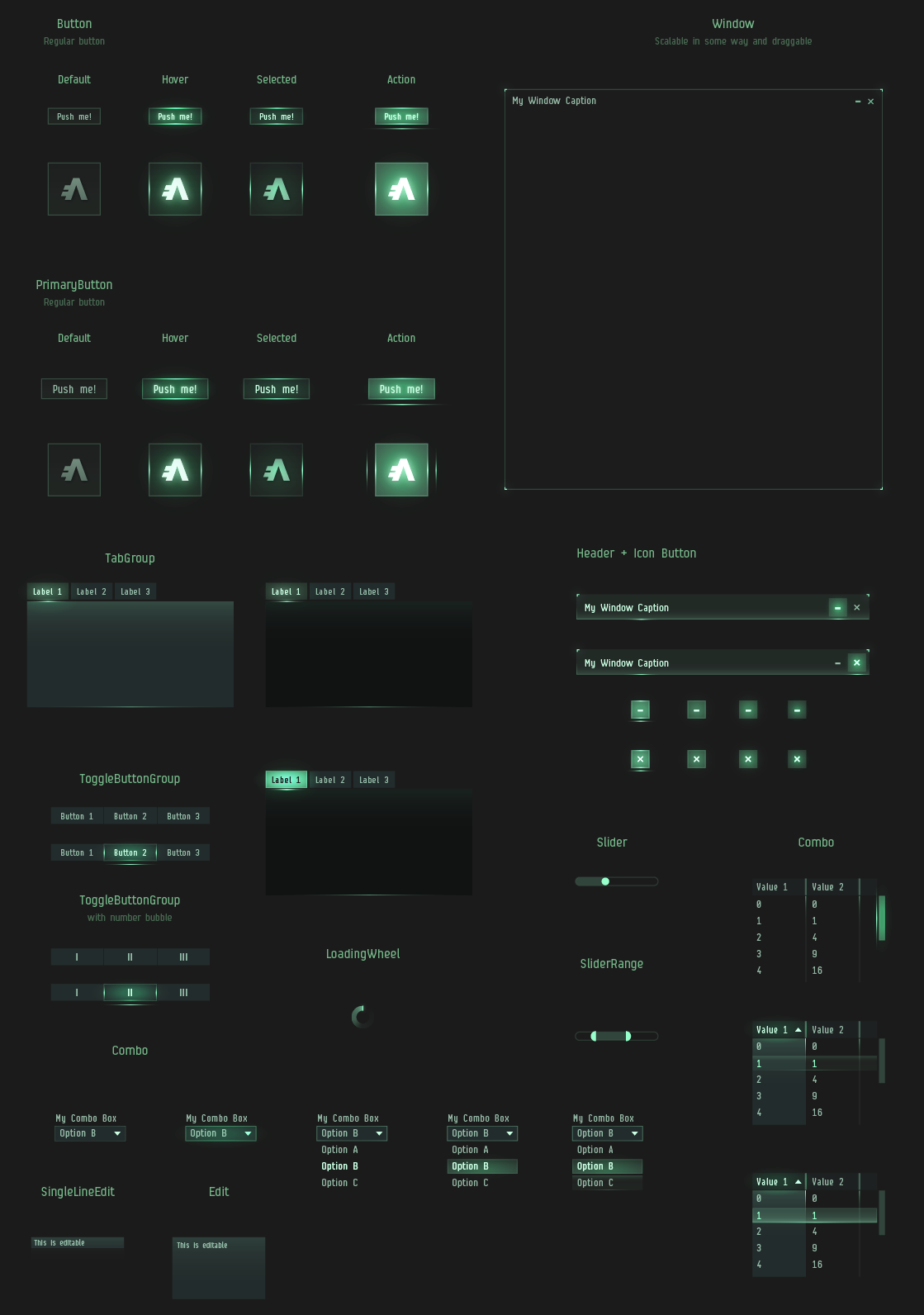
As if all of this wasn’t enough, we’ve additionally re-done most of the UI control skins. This includes windows, buttons, checkboxes, scrolls and tabs. Instead of excessive yapping, I’ll let the following pictures do all the talking.
(click to enlarge)
Iconic icons
Last but not least, we’ve completely re-done all window icons. The brightest reflection of this change is to be witnessed in the Neocom. We are introducing a whole new set of modern, monochrome, clear cut icons. I’m going to go ahead and predict that some of you are already thinking; “Strip all color! Are you insane?”. Although I can neither confirm nor deny any claims of insanity, I can assure you that once you’ve learned the new icons (which takes practically no time at all) you’ll be opening windows faster than ever before. As a matter of fact, it has been scientifically proven that stripping color away from such icons reduces search time, as it allows your brain to focus purely on form. It’s a “try it to believe it” kind of thing. I was skeptical at first too.
(click to enlarge)
The above example is to show the normal state and hover state of the new Neocom icons. The shapes of the new icons are all very much on the operating table still but we wanted to get some version of them on SiSi to start having a conversation with you on their shape and style. We recognize that the old icons have been part of the game from the beginning and have a special place in our hearts. We want to make sure they can be remembered and will make sure the collection will available to download as a .ZIP file after the update for those that want to own a piece of EVE UI history.
And finally
What we want the UI Modernization project to achieve is forming a really solid visual foundation to build on. There are still various things that will not get touched this time around, but having a stronger foundation will make it that much easier to sculpt prettier things once we get there.
These changes will be on Singularity today. There is still a lot of work to be done, so please take it for a spin and give us your feedback on the forums. We’re currently aiming to get the final thing out with the Rhea release on December 9th.
Enjoy your spaceships in a responsible manner. - CCP Optimal [ Original Dev Blog ]
On the eve of the Phoebe release, jump-drive activity was a hot topic. Players can observe the patterns of cynosural beacons lighting up around New Eden by looking at the map statistics in the client. This led some to wonder how the activity might look over an extended time period. After seeing this repeatedly discussed in the past few days across the forums, blogs and social media, I decided to dive in to the data to see what I could find…
Across the 35 day period between October 1st until the Phoebe deployment at 10AM on November 4th, 263,344 beacons were activated. Operations peaked the day before Phoebe with 15,572 beacons activated, as players looked to perform last-minute maneuvers before jump-drive changes made such travel more restrictive.
We’d like to share this data with you in even more detail, so that you can work with it yourselves. The file in the following link contains a listing of all activations of Cynosural Field Generator modules on Tranquility (excluding the covert variant) for the 35 day period mentioned above. Each line shows the activation time and the solar-system in which the beacon was activated. (Other data points such as pilot IDs, xyz coordinates have been removed, in the interests of not exposing detailed intel)
We look forward to seeing what interesting visualizations and analysis that the community will come up with! Please let us know at share@eveonline.com what you make.
Hi space friends!
CCP karkur here to tell you about a few often-requested changes that are coming your way in Phoebe.
Asset Search and Advanced Search
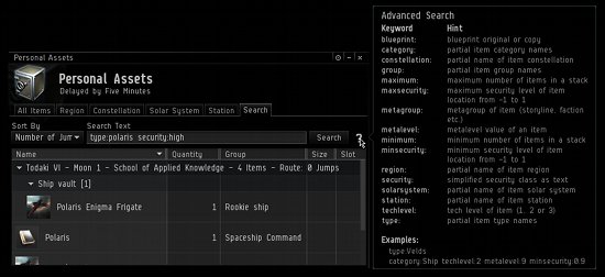
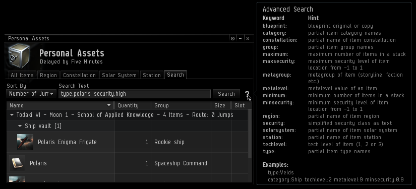
Many of you like organizing your assets into station containers, which is all well and good, that is, until you need to find that Polaris Engima or that ‘Nibelung’ Mining Laser you have misplaced but know you have somewhere. The Asset Search you are used to has not searched inside your containers.
That’s changing in Phoebe– items inside containers in stations will be included in the search results.
I should note that for those who have thousands and thousands of neatly organized items in containers, fetching the information on the items might take a bit longer than you are used to. However, after the data has been cached the searching should be really fast, and you can actually find the items you are looking for
Some of you may know that we have pretty powerful advanced search functionality in EVE. However, I’ve found that surprisingly many citizens of New Eden either don’t know it exists at all, or don’t know how to use it.
We wanted to raise the visibility of this powerful tool, so we have added a little question mark icon in the Asset Search tab, which will show a handy tooltip that lists all the keywords you can use and how to use them when you hover your mouse over it. For further information on the advanced search, please take a look at this dev blog by CCP Frellicus.
(Click image for a larger version)
The Overview States and “Always Show”
The ability to have a “war target”/”fleet member” only Overview has been a commonly requested feature and it is arriving with Phoebe. We will be adding a third entity display setting called “Always Show” to the overview. Before I explain what that means, let me go over how the display settings currently work:
Entities (ships, drones, etc.) on the same grid as you in space are displayed in the Overview as long as they do not match a state that is filtered out. This can be quite tricky and confusing because any one entity commonly has multiple states (war target, outlaw, etc).
For example, you can have a corp(1) and alliance(2) mate in the same fleet(3) as you, but is also a supspect(4) with security level below 0 (5), and he‘s neutral(6) to you. If you filter out any of those 6 states he matches, he will not appear in your Overview, which is not always ideal. This has for example caused war target hunters some issues, because in order to have war targets in the Overview, they cannot filter out all those random neutrals they meet on their travels, since their war targets might be neutrals too.
So what is this new display setting? As I mentioned above, we refer to it as “Always Show”, and what it means is that if an entity has a state that is set to “Always Show”, it does not matter if any of the other states it also matches are filtered out, the entity will always appear in your Overview.
If an entity does not have an “Always Show” state, it’s displayed by default as long as it does not have a state that is filtered out, just like before.
To summarize:
Always show
Entities with this state will always be shown regardless of the display setting of additional states they may have
Filter out
Entities with this state will be filtered out unless they have additional states that are set to always show
Show by default
Entities with this state will be shown unless they have additional states that are filtered out
These changes are compatible with all current Overview profiles, which are simply treated as having no state with the “Always Show” setting.
It‘s worth mentioning that although we talk about “Always Show”, nothing will override the settings in the Group tab. That is, if you have chosen to not see Battleships in your Overview, your fleet mate in the Raven will not be in the Overview, no matter how your state display settings are.
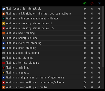
With this change, we’ve had to change the interface where you control the display settings of the entity states. The states are back to being in one list, but now you have 3 radio buttons (“Always show”, “Filter out”, “Show by default”) to choose from for each of the states.
You can click each of them individually, or select many states in the list and set them all at once by clicking on the header icons.
Scanners
Many have asked for the ability to have both the Probe Scanner and the Directional Scanner open at the same time, but none have pleaded more than the wormholers among us who are not only constantly scanning with probes but also need to be on the lookout for someone sneaking up on them. These two very useful scanning tools have lived together as tabs in the same window, along with a lesser used tool, the Moon Analyses tab. In Phoebe we will be splitting them apart, giving each its own window, and these can of course be stacked just like any other windows.
Shortcut for Directional Scanner
We have added a shortcut to directly open the Directional Scanner.
The Rest
Lastly, I want to mention a few small changes we have implemented recently but not had the opportunity to tell you about:
Added a Booster Timer that clearly shows you how much time you have left on your active boosters, their benefits, and side effects. This timer is displayed next to other timers such as Weapon and Limited Engagement timers.
Added the ability to select which overview preset to use when scanning with the Directional Scanner.
Added a visual timer in the HUD on modules (such as micro jump drives and cloaking devices) that have cooldown time to indicate how much was left of the cooldown.
Added the ability to name your jump clones. This can be done through a right click option on the jump clones in the Character Sheet
We hope these small changes make your stay in New Eden a little bit more pleasant.
Fly Safe,
Hello Capsuleers! This is CCP SoniClover on behalf of Team Banana Stand, telling you about one of our new features in Phoebe: Mission Objective Guidance. Mission Objective Guidance is a system intended to aid people in completing missions they’ve accepted by giving hints on what to do next to progress or complete the mission.
There were several reasons for going for this feature, the two main ones being to reduce likelihood of players becoming confused or frustrated when doing a mission and to allow us to start delving into the pretty arcane agent/mission code for future work on the framework of missions.
In deciding on how the feature should function, we had two general rules of thumb. One was to make this as unobtrusive as possible and the other was to avoid having hints lead the player by the nose too much. As such, the guidance provided indicates the general direction or area to focus on, but should not be completely brain-dead instructions to follow. This is of course a fine line to tread, so please let us know where you feel we stand here.
So let’s go over how the Mission Objective Guidance system works in a bit more detail.
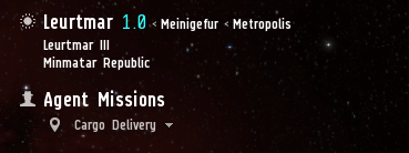
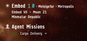
The system uses the Agent info panel in the upper left corner of the screen. This means you can turn the guidance system on or off alongside the panel (by clicking the human silhouette icon to the left of the header). To the left of the mission name in the panel, there is now an icon that hints at the state for that mission. Here is an example:
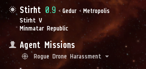
This icon is then updated when the player does something that progresses the mission to a new state. Here is another icon example:
When a mission is completed, the icon changes to the mission complete icon:
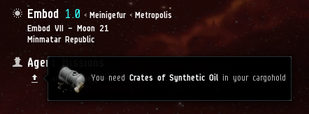
To get more information, the player can mouse-over the mission to get a tooltip with further information. This information depends on the mission and the current state of it. Let’s look at a few examples:
Notice here that the hint tells the player what item he needs, but doesn’t tell him where that item is.
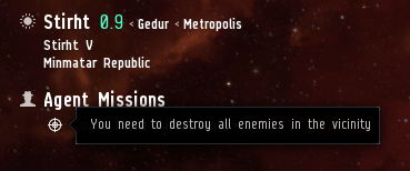
Another example:
This is a common tooltip for instance when you need to kill all NPCs to activate the acceleration gate to the next deadspace complex area.
This is not an exhaustive list of all the states or tooltips. We’ll have that in the patch notes, so check them out when they are published for more details.
The mission system is an old bastard in many ways and creating a generic system to cover all the ancient snowflakes still floating around in it is far from easy. So while the Mission Objective Guidance system does cover the vast majority of missions, there are a few for which we can only give very vague hints. Often, this means simply telling the player to refer to the Journal for further information.
To help players a bit more, we have a few graphical elements to emphasize what’s going on.
When a state changes, the icon in the agent info panel blinks to indicate this.
When the mission is specifying a particular object, for instance a structure to destroy, clicking on the state icon will move the camera to show the object. This will only work if you have the camera tracking on. This is an exception to the rule of not giving too strong hints, because we want to improve how players can find objects in the space scene without having to resort to the overview.
If the tooltip references a specific item, clicking on the name of the item in the tooltip will bring up the show info window for that item. This includes destination system, allowing you to set destination.
Future iterations on this feature will cover more of the special snowflake missions that we can’t track adequately at the moment and will possibly offer further polish on the visual side, especially in making people more aware of mission objectives in their surroundings.
The Mission Objective Guidance system is on Singularity right now, so head over there if you want to test it and please give us feedback if you run into anything strange. [ Original Dev Post ]
Hello capsuleers, CCP Leeloo here with some excitement about all things CSM! If you don't know what the CSM is, then check this out! CSM9 Summer Summit
Remember I said we would release the minutes on 31st of October? Well, that was not true. BUT! Don’t start throwing tomatoes, rocks and small furry animals at me, we will actually release the minutes earlier, in fact, RIGHT NOW, so click the image below and enjoy your warp through time to read 146 pages of declassified goodness about the Summer Summit! Click Here for CSM9 Summer Summit Meeting Minutes!
Secondly, since I'm writing this, I would like to make a few more announcements regarding the CSM right now. Plus, one paragraph is not enough to be a dev blog! CSM9 Winter Summit
So, since we just visited the past, it's time now to talk about the future! Tune in for the CSM9 Winter Summit that will be held from 20th to 23rd of January 2015. Yes, you are seeing it correctly – we have increased the duration of the CSM Summit by 1 day. We feel that cramming the summit into three days sometimes leads to burnout for CSM members and can result in the last or first few session of the day dragging out a little. We want to make sure that both the CSM and CCP get the most possible benefit out of each summit, as it's something we take incredibly seriously. This extra day means that the CSM will be even more involved in our work than ever before, and have further access to development. CSM10
Unfortunately, while CSM9 has additional time for the summit, they won’t have any additional time for their actual term. Furthermore, they will be a short-term CSM as we will be announcing the new council during the keynote at FanFest 2015, which has been moved forward to March 21 to coincide with a solar eclipse here in Reykjavik.
For all people who want to try themselves at this tough job, I will start accepting the applications for CSM10 on January, 30th and the elections themselves will happen on February, 25th.
Don’t worry if you don’t know anything about the process, I will be publishing another dev-blog regarding the elections closer to that date. Internal changes
With the new release cadence, we have realized that we need as an efficient team as possible and we can’t afford to have a CSM that is only partially functioning. We simplified a lot of internal processes and we are also working on updating the CSM White Paper right now. There will be more discussion of this and finalization at the CSM9 Winter Summit.
The main change that some of you might have noticed – we found a new way to deal with resigning members. This is thanks to your feedback from this thread, by the way!
Before now, we would just run a short staffed team. This will be changing and we will be replacing members if they decide or have to leave (we are also looking into a possibility to deal with inactive members).
We will be removing the person who has left from the ballot and re-running the elections with an updated ballot.
However, this will only be done if there are three or more release cycles left till the end of the term. We are still polishing this idea, so please, leave your feedback in the discussion thread for this dev blog.
Please expect more information about this and other changes with the CSM later in the future.
<3 @CCP_Leeloo
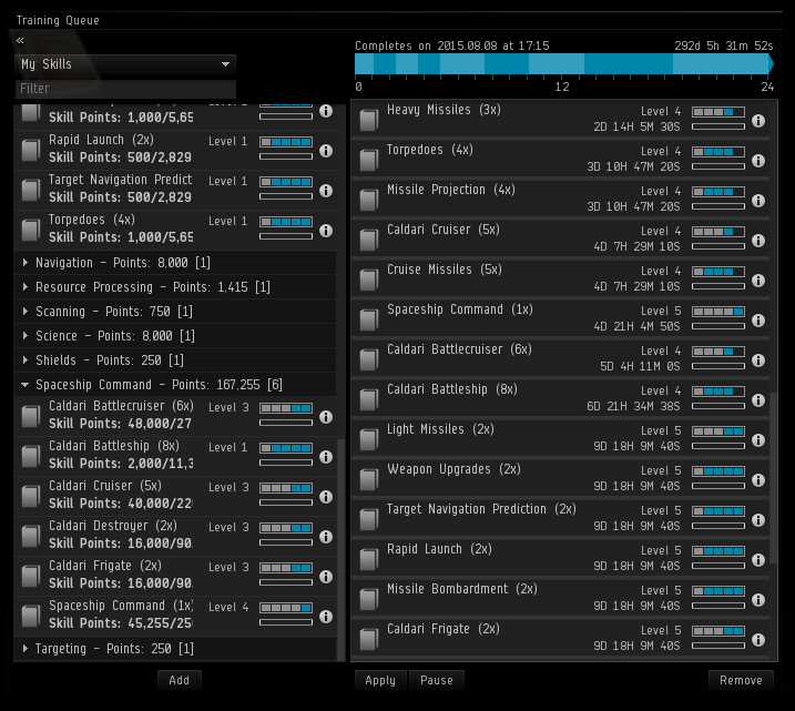
Quick history lesson: once upon a time there was no skill training queue and much use of alarm clocks and other reminders was involved in “optimizing” a skill-training plan. There was therefore great joy when the skill queue was released in the revered Apocrypha expansion in 2009. This joy was only slightly tempered by the limitation that skills could only be inserted into the queue as long as they started within the next 24 hours.
In Phoebe, by removing the 24-hour window for inserting additional skills, we will be providing the possibility of skill queues containing multiple skill entries requiring many more than 24-hours to train. We believe the value of this for you, with many of you needing to manage your skill training alongside busy and varied schedules throughout the year, will be considerable.
Since the skill queue will now be opened up to provide for skill training plans that are not limited by a short installation window and be effectively unlimited in time, there are a few points to note.
Trial accounts will remain limited to the 24-hour window for inserting skills into the queue.
Strictly speaking the skill queue will have an installation window of 10 years. Further, the skill queue will remain limited to 50 entries in total for the time being. These limits are being maintained for safety as this significant change to the skill-training system goes live, and are not set in stone.
We wanted to focus on (effectively) removing the arbitrary time limit without getting lost in new user interface design or additional features. As the skill-training system is so central to EVE, we felt that it is important to take small steps and not change too much at this time.
All that said, as you can see from the example above, a training queue can now be many months long and it is certainly possible to construct a queue that will run for years, even with the 50 entry limit.
While making this change we have noted further areas for improvement and very much look forward to your feedback and ideas about the skill-training system and related gameplay.